Energy 2050 Economic Abyss

World Energy to 2050
Forty Years of Decline
Putting Energy Sources in Perspective
Part 6
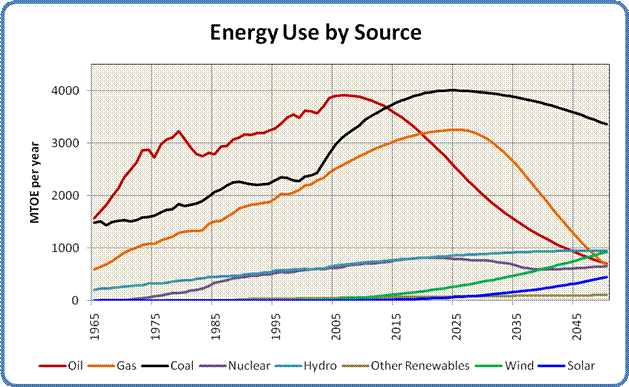
Figure 11: Energy Use by Source, 1965 to 2100
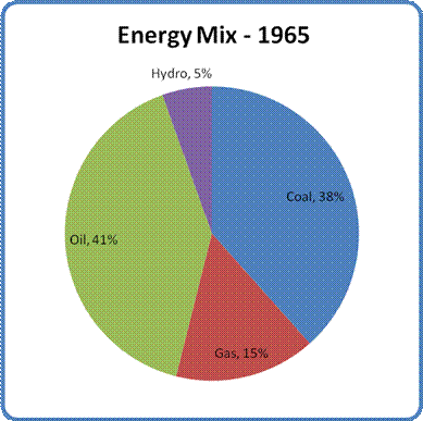
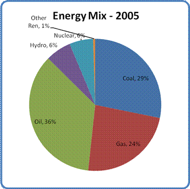
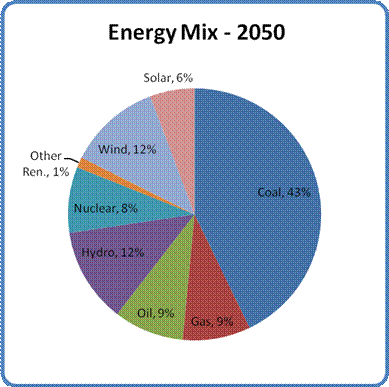
Figure 12: The Global Energy Mix in 1965, 2005 and 2050
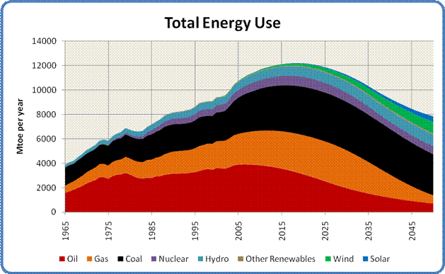
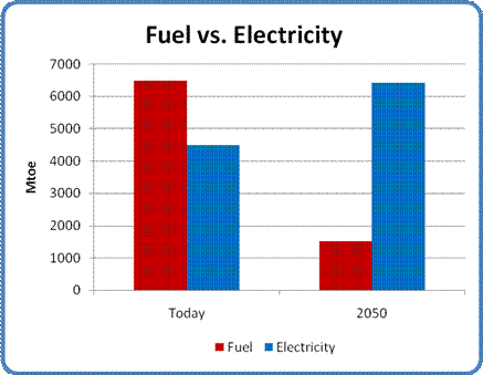
Figure 14: Fuel and Electricity Use, Today and 2050

Forty Years of Decline
Putting Energy Sources in Perspective
Part 6
By Paul Cherfurka
Putting Energy Sources in Perspective

Figure 11: Energy Use by Source, 1965 to 2100
Figure 11 shows all the above curves on a single graph, giving us a sense of the relative timing of the various production peaks as well as the rates of increase or decline of the different sources. As you can see, fossil fuels are by far the most important contributors to the world's current energy mix, but oil and natural gas will decline rapidly over the coming decades. By the middle of the century the dominant player is coal, with oil, gas, hydro, nuclear power and renewables making very similar contributions to the world's mid-century energy supply.


Figure 12: The Global Energy Mix in 1965, 2005 and 2050
Figure 12 shows the changing contribution of each energy source relative to the others over time. There are three interesting things to note about this progression.
The first is the large role that coal plays in the global supply picture. That situation is not entirely unexpected, but it hints at the difficulty we will have trying to replace our dirtiest and most dangerous energy source as our supplies of oil and gas decline.
The second is the increasing diversity of energy sources over time. This change is a good thing, as it indicates that various regions will have a much wider range of energy options available to them than in the past.
Finally, by mid-century energy sources that do not generate greenhouse gases may be supplying 40% of the world's power as opposed to 13% today and only 5% in 1965. Combined with an overall (albeit involuntary) reduction in global energy use by 2050, that shift bodes well for reducing the carbon dioxide our civilization exhales into the atmosphere.

Figure 13: Total Energy Use, 1965 to 2100
Figure 13 has all the energy curves added together to show the overall shape of total world energy consumption. This graph aggregates all the rises, peaks and declines to give a sense of the complete energy picture. The graph shows a strong peak in about 2020, with an ongoing decline out to 2050. The main reason for the decline is the loss of oil and gas. The decline is cushioned by an increase in hydro and renewables over the middle of the century, and averages out to 1% per year.


Fuel vs. Electricity
The energy we use can be broadly categorized into two classes, fuel and electricity. The former consists of oil and gas, the two sources that will be in decline over the next half century. The amount of electricity we produce from all other sources including coal will increase, though not enough to offset the decline in fuels in terms of the energy they supply. Figure 14 shows show how the split between the two classes of energy will change over the next 45 years.

Figure 14: Fuel and Electricity Use, Today and 2050
In addition to the loss of transportation mobility it represents, the loss of the enormous contributions of oil and natural gas means that the total amount of energy available to humanity by the middle of the century may be only 70% of the amount we use now. That shortfall contains an ominous message for our future that is the subject of the next section.
Next
Part 7: Effects and Conclusion
(February 27, 2016)